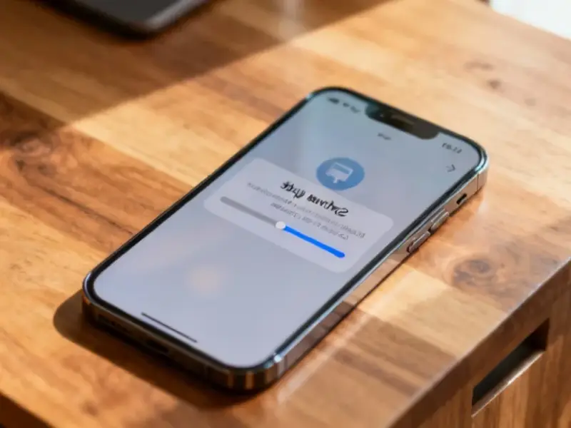
According to Windows Report | Error-free Tech Life, Microsoft is quietly testing a visual refresh for Xbox achievements through a recent update to the Xbox Cloud Gaming web experience. The changes were first spotted by TrueAchievements in the new Xbox Cloud Gaming UI preview. The redesigned achievement pop-ups feature cleaner icons and more subtle animations, making it easier to distinguish between standard and rare unlocks at a glance. Sources indicate this is purely a presentation update with no immediate plans to overhaul the underlying achievement system itself. The new look is part of a broader Cloud Gaming web interface refresh that aims for a more console-like feel with smoother navigation. To see the changes, users must manually enable the Preview features option in the Xbox Cloud Gaming website settings.
A long-overdue facelift
Look, let’s be honest. The current Xbox achievement pop-up has looked pretty much the same for what, a decade? Since the Xbox One era. It’s functional, sure. But it’s also a bit chunky and loud. This new look, even in its early preview state, feels like a step towards modernity. It’s cleaner, the animations are less “in your face,” and that rarity icon is actually clear now. It’s a small thing, but these little bits of polish are what make a platform feel fresh. And given that achievements are a core part of the Xbox identity, it’s weird this visual layer has been so stagnant for so long.
Cloud gaming as the test bed
Here’s the interesting part: they’re rolling this out on the Xbox Cloud Gaming web interface first. That’s basically Microsoft’s public beta playground. It makes perfect sense. You can push a UI update to a website way faster and to a more controlled audience than you can to millions of consoles. If something breaks or people hate it, you can tweak it or roll it back without a full console firmware update. It’s a smart, low-risk strategy. But it also heavily implies this isn’t *just* for cloud gaming. This feels like a test for a future system-wide update. Why redesign it for one niche platform if you’re not planning to spread it around?
Don’t expect a system overhaul yet
Now, here’s the thing. Everyone gets excited and starts dreaming of a full achievement system revamp—better tracking, challenges, legacy stuff, you name it. But according to the sources, that’s not on the immediate menu. This appears to be skin-deep. A new coat of paint on the same old house. And you can see the unfinished edges in the preview: missing descriptions, janky audio, limited animations. So, while the new visual direction is promising and frankly needed, I think we should temper our expectations. This is Microsoft dipping a toe in the water to see if the temperature is right for a fresh look, not re-engineering the plumbing.
What it means for players
For the average player, this is a net positive if it eventually rolls out everywhere. A less intrusive, more elegant notification is always welcome. It shows Microsoft is at least thinking about the user experience details on the software side. But it also highlights a slower pace of evolution compared to some competitors. Basically, it’s a good first step, but it’s a very small one. The real question is what comes next. Does this visual refresh pave the way for more substantive changes to Gamerscore or achievement categories down the line? Or is this just Microsoft finally getting around to a UI element that was long overdue for a tune-up? I’m leaning towards the latter, but hey, a little modernization is better than none.


